blog · git · desktop · images · contact
(Almost) square pixels in the terminal
2016-12-17
VT100-like terminals and today’s terminal emulators are meant to display text. As such, font sizes like 8x16 or 7x15 are common. In other words, they’re almost twice as high as they are wide. While still not the optimal text display – an “i” should be narrower than an “m” –, it’s a good compromise. The terminal is some kind of grid and you can easily address each cell. It’s just like the computer screen itself, but a terminal application can instruct the terminal to print an “A” just by printing an “A” – the terminal application does not need to address each pixel individually and it does not need to provide a font. This results in smaller amounts of data to be transferred to and from the terminal, which makes it more suitable for slow links.
It can be fun to do things that are not meant to be done. For example, displaying images in the terminal or displaying other kinds of graphical information. But how would you do that if you can only display “text”?
One rather complicated approach is to use ASCII art, i.e. use characters whose shapes vaguely resemble your image (asciiworld):
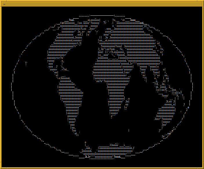
This can be done algorithmically, but it either does not look optimal or the code is complicated. Manual ASCII art is much more elaborate.
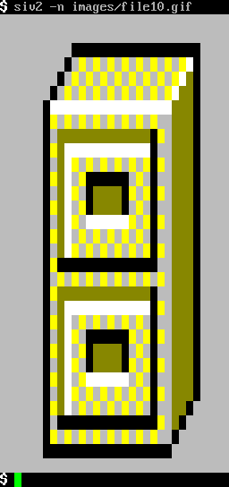
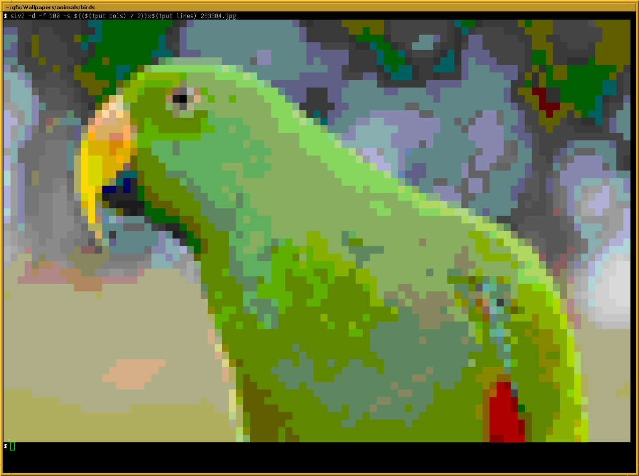
A different approach would be to map pixel data onto the cells of the terminal. That is, for each pixel you print a space character while the background color is set to the pixel color – or something close, since you only have 8, 16 or 256 colors available. For this image it would look like this (siv2):
The ANSI escape sequences to print one such cell would look like this:
\033[48;5;196m \033[0m
It sets the background color to “196”, prints a space, and then resets all attributes (that’s optional if you keep printing one pixel after the other).
As my font size is 8x16, the image is distorted. It’s too high. What can we do about that? When you’re limited to ASCII, you have little options. One of them is to draw two spaces for each pixel:
\033[48;5;196m \033[0m
It then looks like this:
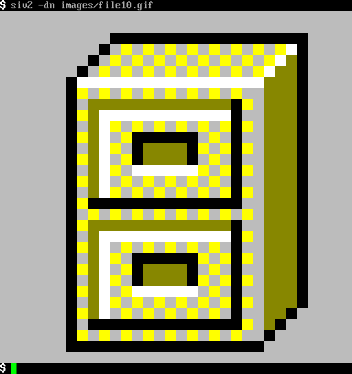
That’s the correct aspect ratio and the image is no longer distorted.
However, a lot of space has been wasted. In fact, the original image has been resized by a factor of 16 (since my font is 8x16).
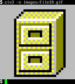
You can double the resolution if you can use extended character sets.
Let’s stick to UTF-8 encoded Unicode since it is very wide spread today.
Unicode defines the code point <U+2580> which is “the upper half
block”. It looks like this:
▀
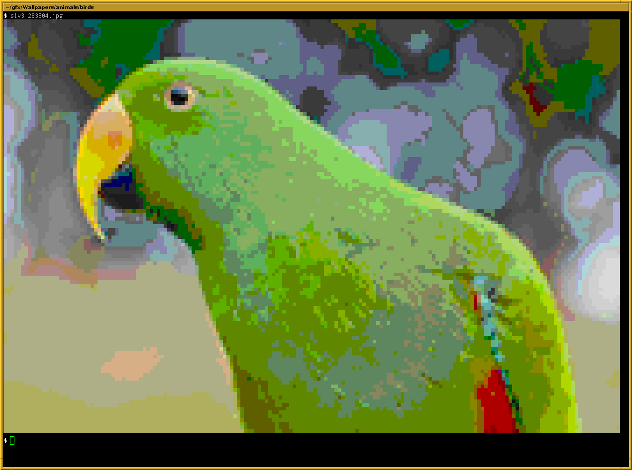
This “character” is part of the block elements defined in Unicode. What we can do now is print this one character and set foreground and background color: The foreground color will only control the actual upper half and the background color will control the lower half. This means we can squeeze two rows of pixel data into one row in the terminal. The escape sequences to do so would look like this:
\033[38;5;46m\033[48;5;196m▀\033[0m
The terminal will print two “pixels”, a green one in the upper half and a red one in the lower half. Now our little GIF can look like this (siv3):
The difference becomes much clearer when comparing two larger images:
Nice square pixels. Well, mostly. If your font is not twice as high as it is wide, you’ll still get a distorted image. That font right there has a size of 7x15 pixels. But most fonts are almost okay. :-)